
1. UX/ UI Experience:
User-hostile, conversion centralized
The core component to resonate with customers and ensure on-scene engagement is by providing stand-out user experience (UX) complimented with strong user interaction (UI). UX and UI both go conjointly to maximize user interactions. UX design being more technical and analytical involves extensive research to analyze and improve customer’s experience. UX needs the understanding of precise business personas to craft a targeted skill. On the other hand, UI lies more along the lines of graphic designs. In addition to how the site operates, it also about its looks and feels. It acts as a translator for a brand's strengths and voice onto the screen. Working in a bunch, UI and UX complement each other to create a sterling product. Concurrently, UI and UX create a beautiful user experience that takes the user on a preordained journey known as user flow. Our role lies making sure that the drive is one that directly supports your business goals while satisfying user's needs and interests. A harmonized digital experience is necessary to connect brands to the people who matter the most.
Technique:
• Observable data scrutiny
• Personalized architecture
• Website map
• Wireframe
• User flow
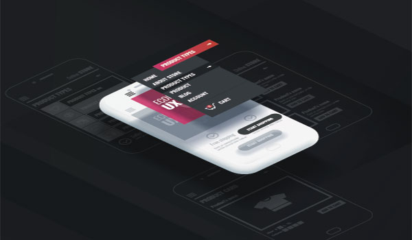
2. Mobile sensible designs:
Customers won't be sitting on their desktops always. They are on their phones, and your brand needs to be too — the solution: mobile responsive design.
It means that your site should dynamically resize to work on a phone, tablet, or desktop, without sacrificing content, design, and functionality. Making your presence conveniently available on every platform makes sure your customers interact fully with your digital presence irrespective of their existence. This helps to boost your search ranking as well. How? ICYMI, search engines are prioritizing sites that follow "mobile- first" approach. It also makes more accessible for search engines to crawl each page when it is optimized for all screen sizes. This helps your website climb up in the SERPs. If you wish to be a brand, it’s time for your site to be fully mobile responsive.
Whether you are creating a new architecture for your site or merely updating and optimizing your current website, we make sure you are ready to evolve in the digital ecosystem. The process starts with understanding your brand's need after which we dig into the architecture of your brand to understand the ins and outs. Thereby creating a responsive structure and design translates your brand and user experience onto a new piece of technology.
Creating a mobile responsive design means the code of every line of the site should be thoughtful, strategic, and practical. Our architectures resize all aspects of the site, from headers to the menu bar to magnetic media.
With rigorous testing and QA work, we provide a consistent user experience. Attention to every detail and technical acuity ensures your site looks and performs exceptionally well on every screen: mobile or desktop, iOS or Android.
3. Motion Design:
Small screens may leave lesser room for you to make your mark. This is why major brands are including animations in their style guides. From screen loading to feedbacks to transitions to branding, motion design guides and orients your customers by keeping your brand front and center.